- Written by Don Lutkus
- Views: 2143
A box of brochures lands on your desk, fresh from the printer. They look good, but when you compare them to the brochures printed last month you notice it – the logo color looks off. It’s a little darker compared to the others. Why does it look different? If you ask your designer, you'll most likely hear a heavy sigh followed by “It’s complicated.”
Color consistency is tricky. There are many variables when reproducing color. Most of them can be controlled, but some just can’t. Let’s start with a variable that your designer can control – the numbers.
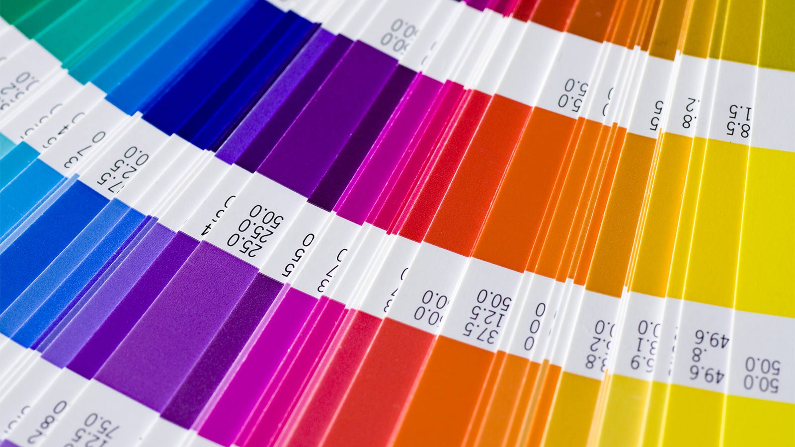
It's all about the numbers.
We live in a digital world, and digital is all about numbers. Color consistency starts with using consistent color numbers from project to project, and piece to piece. As a client, you can ensure color number consistency by developing a corporate style guide that includes precise numbers for all of your company’s colors. The guide should include CMYK (for printing) and RGB (for on-screen) numbers. Don’t get bogged down with PMS numbers. PMS is useful when you’re choosing corporate colors, however it’s better to publish the CMYK and RGB equivalents of PMS colors in your guide. Give the guide to every designer that you hire. The result will be color consistency, regardless of who designs your materials.
Now, for the bad news. The things your designer has limited – or no control over.
Different vendors.
different devices.
different results.
In the story I told at the start of this article, one thing I didn't mention is the fact that the new brochures were not printed at the same printer as the old brochures. Two different companies. Two different presses. You'll have better control if you select a single printing company for all projects. Printers calibrate their equipment for consistency. It can be a big step toward avoiding color problems.
Digital devices – computer and phone screens – are not controllable at all. They all use RGB (red, green, blue) to create color, but there are hundreds of manufacturers, most of which use slightly different calibration techniques. Some screens have a bluish tint, some are warmer and brighter. It's all over the board. My advice: I'll repeat it – numbers! Make sure you use consistent RGB numbers in your digital designs. But please, don't compare your computer screen to your iPhone. They're different. Let it go. The good news is that screen technology is improving so fast that consistency is becoming less and less of a problem.
Different papers.
Different results.
Broadly, there are two categories of paper: coated and uncoated. Coated papers have clay or polymer materials on the surface. Ink floats when applied to coated paper. Ink on coated paper looks vivid, cleaner, more modern.
The second category is uncoated paper. Think office paper. The stuff in your office laser printer. Ink is absorbed into this type of paper. If you print your logo on uncoated paper and compare it to the same logo on coated paper, they will look different. This comes down to the laws of physics. There's nothing we mortal designers can do about it. A simple suggestion here is to use the same paper stock for pieces seen in a shared environment. For instance, product brochures. Pick and stick. This is another reason to choose a single vendor for your printing.
So there you have it – a basic guide to color consistency – the main reasons why color goes wrong on your projects. However, if color is extremely important for your brand, we can discuss many more techniques and approaches. Let's talk. I have over thirty years of design experience working for brands such as Bose and Newell Rubbermaid.